Introduction
Agni UI is an open source and easy to use CSS component library. It helps developers with all experience levels to quickly build components by just adding classes. Now complete your dream project rapidly and focus more on logic than styling.
Installation
In order to use Agni UI in your projects , simply copy the one-line code below and paste it in the < head> section of your html
Avatars
Avatars are images that users can set as their profile picture. They can be custom photos, uploaded by users, or generated as Identicons as a placeholder.
Default Avatar
The default avatar is round in shape and to create avatar you can simply add the avatar class. There are three different sizes available and you can choose between avatar-lg | avatar-md | avatar-sm
Square Avatar
The square avatar is square in shape and to create avatar you can simply add the square-avatar class. There are three different sizes available and you can choose between avatar-lg | avatar-md | avatar-sm
Badge
Badges are small circle to display status, some count etc depending on where they are used. They are usually positined on the top right or bottom right of the parent component.
Profile Badge
Profile badge is used to display the current status of the user. It has 3 variants online | offline | dont-disturb We need to give class of badge to parent element and variant class on the child element.


Number Badge
Number badge is used to show the number of new items present in the parent element. We need to give class of badge to parent element and variant class on the child element.
Alert
Alerts are short messages that are shown to the user while performing some task. It is used to primarily grab the users attention and convey a message without interrupting the flow of current task.
Simple Alert
Simple alerts can be created using alert class,followed by the variant name. Variant can be primary | error | success | warning
Outline Alert
Outline alert has no background color with a border and text color signifying the alert.
Cards
Cards contain content and actions about a single subject. Cards make it very easy to scan all the actionable and relevant information about the subject. Elements, like text and images, should be placed on them in a way that clearly indicates hierarchy.
Cards with Badges
Cards with Badges contain an important and quick information about the subject in the badge. The badge might be static or dynamic with some action depending on the use case. Use class of card-badge along with card-tag on the badge component.
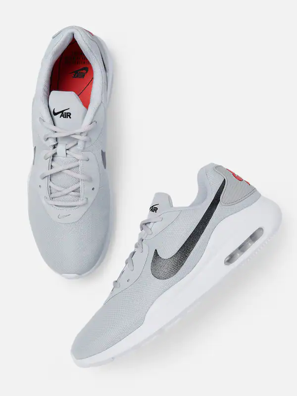
Nike
Nike Airforce
Rs.4900 Rs.9999
Cards with Dismiss
Cards with dismiss would simply remove the card component from the page or screen. Give an id of dismiss on the main outer card component and add onclick="dismissCard()" on the dismiss button.
Clicking on close button will dimiss this card.Refresh page to bring it back.

Nike
Nike Airforce
Rs.4900 Rs.9999
Cards with Text Overlay
Cards with text overlay allows us to place an important text on the image mostly to make a statement. Use class of card-with-text along with text-overlay on the text to display on the image or card component.

Text only cards
Text only cards contains no image and comprises mostly of text with some other elements like buttons. Use class of text-only text card.
This is heading
This is subheading
This some Lorem ipsum dolor sit amet consectetur adipisicing elit. Impedit, numquam nulla temporibus alias ipsum natus quod unde necessitatibus voluptatibus.
Horizontal Cards
Horizontal cards are rectengular in shape and elements in the card align in rows. use class of card-horizontal for Horizontal cards.

Nike
Nike Airforce
Rs.4900 Rs.9999
Cards with shadow
Cards with shadow produces shadow at the bottom and right side of the box. use class of card-shadow for producing shadow on the cards.

Nike
Nike Airforce
Rs.4900 Rs.9999
Image
Image components are used to display images on the websites.It can be of various styles but most prominent ones are squares & circle with responsiveness as an important property.
Square Image
Square Images are the square shaped, with a default dimension of 150px X 150px. Use class of square-img to give square shape on an image.



Round Image
Round Images are the circular, with a default dimensions of 150px X 150px. Use class of round-img to give round shape on an image.


Responsive Image
Responsive images will automatically adjust to fit the size of the screen.
Use class of responsive-img to make image responsive.
Note : Resize the browser window, to see the responsive property.

Input
Inputs are necessary for user interaction with the website. Inputs are used to take information from the user, and then save the data to the server, accordingly.
Form Input
Form input has several input fields to take an input from the user and pass
on that data to the server.
Use class of form on all the form elements
Form Input Error
Form input error can be customized to show error or error-message,
and change color accordingly.
Use class of input-err to show error msg and change the color
Password
* Wrong Password. Try again.
Radio Input
Radio button allows the user to select only option amongst a list of items. Use class of radio on the class containing radio elements.
Checkbox Input
Checkboxes allow the user to select one or more items from a set. Checkboxes can be used to turn an option on or off. Use class of checkbox on the class containing checkbox elements.
Text Utilities
Text utility classes can be used on any element for text modification/alignment, element placement, or to adjust padding and margin etc.
Headings
There are inbuilt semantic HTML elements from h1 to h6 or you can use heading
classes
where semantic elements cant be used.
Use any class from h1 to h6 depending on the requirement
This is Heading 1
This is Heading 2
This is Heading 3
This is Heading 4
This is Heading 5
This is Heading 6
Small Text
You can use class of text-sm for displaying small text. Similarly there are classes like text-md & text-lg for medium and large text respectively.
This is small text
This is medium text
This is large text
Gray Text
Use class of text-gray to make the text colory gray anywhere.
This is medium size gray text
Center Text
Use a class of text-center to align any text in the center.
This is medium size center text
Grid
The CSS Grid Layout Module offers a grid-based layout system, with rows and columns, making it easier to design web pages without having to use floats and positioning.
Grid - Two Column
The most used grid layout is of two equal columns grid layout.
You can use grid-2-col class to create two column grid layout.
Also, to give gap between columns use class of col-gap.
Grid - Three Column
Another useful grid layout is three equal column layout. You can use grid-3-col class to create three column layout in grid. Also, to give gap between columns use class of col-gap.
Snackbar
Snackbars inform users of a process that an app/website has performed or will perform. They appear temporarily, towards the bottom of the screen. They shouldn’t interrupt the user experience, and they generally don’t require user input to disappear.
Simple snackbar consits of elements stacked in a single row
with
action buttons generally on the right.
Use class of snackbar on the main class with elements inside it.
Lists
Lists are continious vertical indexes of text or images. It can be in various combination of texts and images. The left side navigation bar on this page is a perfect example of a list that is displaying the list of items on this page.
Simple List
Simple list is a vertical index of items. The items can be text,images or
hyperlinks in various combinations.
Use class of simple-list on the main class and class of list-items for
the items in the list.
- List Item 1
- List Item 2
- List Item 3
- List Item 4
Notification List
Notification list is useful to most recent changes of various types to a user
depending on different use cases like Messaging app, social media apps etc.
Use class of notification-list on the main class and class of
list-items for
the items in the list. list-items can have images and texts or combination as per the
requirement.
-

John Jacob
Lets discuss our project
-

Paul Ryan
Lets discuss our project
-

Mit Romney
Lets discuss our project
-

Paul
Lets discuss our holiday
Modal
Modal displays content which blocks the main view of the UI and it would be closed only if user cancels or interacts with the modal. It is to be used as much less as possible as it breaks the flow of the user.
Use class of simple-list on the main class and class of list-items for the items in the list.
Rating
Rating component allows a user to interact with an UI to give rating for the product or service used.Input is easy and user just needs to tap instead of manually typing the rating number. It is mostly found on ecommerce websites and other places for feedback from customers.
Use class of star-rating on the main class and class of star for each individual stars. The remaining class is for fetching the icons.
Slider
Sliders are used to give a particular input usually within a range to UI without the need to enter any text.
Use class of slider-container on the main class and class of simple-slider for the slider with minimum and maximum values.


